UX Writing for Digital Services - Input field labels and hint text
All text input fields must have visible label text that always stays above and is associated with the input field. Persistent label text is needed for screen readers and improves user experience.
<div class="hse-form-group">
  <label class="hse-label">
    Email address
  </label>
  <input class="hse-input hse-input--width-20" id="" name="" type="text">
</div>Nunjucks macro options
Use options to customise the appearance, content and behaviour of a component when using a macro, for example, changing the text.
Some options are required for the macro to work; these are marked as "Required" in the option description.
If you're using Nunjucks macros in production with "html" options, or ones ending with "html", you must sanitise the HTML to protect against cross-site scripting exploits.
| Name | Type | Required | Description |
|---|---|---|---|
| Name id | Type string | Required true | Description The id of the input. |
| Name name | Type string | Required true | Description The name of the input, which is submitted with the form data. |
| Name type | Type string | Required false | Description Type of input control to render. Defaults to "text". |
| Name inputmode | Type string | Required false | Description Optional value for inputmode. |
| Name value | Type string | Required false | Description Optional initial value of the input. |
| Name describedBy | Type string | Required false | Description One or more element IDs to add to the `aria-describedby` attribute, used to provide additional descriptive information for screenreader users. |
| Name label | Type object | Required true | Description Options for the label component. |
| Name hint | Type object | Required false | Description Options for the hint component. |
| Name errorMessage | Type object | Required false | Description Options for the error message component. The error message component will not display if you use a falsy value for `errorMessage`, for example `false` or `null`. |
| Name prefix | Type object | Required false | Description Options for the prefix element. |
| Name prefix{}.text | Type string | Required true | Description Required. If `html` is set, this is not required. Text to use within the label. If `html` is provided, the `text` argument will be ignored. |
| Name prefix{}.html | Type string | Required true | Description Required. If `text` is set, this is not required. HTML to use within the label. If `html` is provided, the `text` argument will be ignored. |
| Name prefix{}.classes | Type string | Required false | Description Classes to add to the prefix. |
| Name prefix{}.attributes | Type object | Required false | Description HTML attributes (for example data attributes) to add to the prefix element. |
| Name suffix | Type object | Required false | Description Options for the suffix element. |
| Name suffix{}.text | Type string | Required true | Description Required. If `html` is set, this is not required. Text to use within the label. If `html` is provided, the `text` argument will be ignored. |
| Name suffix{}.html | Type string | Required true | Description Required. If `text` is set, this is not required. HTML to use within the label. If `html` is provided, the `text` argument will be ignored. |
| Name suffix{}.classes | Type string | Required false | Description Classes to add to the suffix element. |
| Name suffix{}.attributes | Type object | Required false | Description HTML attributes (for example data attributes) to add to the suffix element. |
| Name formGroup | Type object | Required false | Description Options for the form-group wrapper |
| Name formGroup{}.classes | Type string | Required false | Description Classes to add to the form group (for example to show error state for the whole group) |
| Name classes | Type string | Required false | Description Classes to add to the input. |
| Name autocomplete | Type string | Required false | Description autocomplete attribute to identify input purpose, for instance "postal-code" or "username". |
| Name pattern | Type string | Required false | Description pattern attribute to provide a regular expression pattern, used to match allowed character combinations for the input value. |
| Name spellcheck | Type boolean | Required false | Description Optional field to enable or disable the spellcheck attribute on the input. |
| Name attributes | Type object | Required false | Description HTML attributes (for example data attributes) to add to the input. |
{% from 'input/macro.njk' import input %}

{{ input({
  "label": {
    "text": "Email address"
  },
  classes: "hse-input--width-20",
  inputmode: "email"
}) }}Use hint text to help people avoid mistakes and to give them context. Only add hint text if it adds value.
<div class="hse-form-group">
  <fieldset class="hse-fieldset" aria-describedby="example-hint" role="group">
    <legend class="hse-fieldset__legend hse-label--l">
      <h1 class="hse-fieldset__heading">
        What is your date of birth?
      </h1>
    </legend>
    <span class="hse-hint" id="example-hint">
      For example, 15 3 1984
    </span>

    <div class="hse-date-input" id="example">
      <div class="hse-date-input__item">
        <div class="hse-form-group">
          <label class="hse-label hse-date-input__label" for="example-day">
            Day
          </label>
          <input class="hse-input hse-date-input__input hse-input--width-2" id="example-day" name="example-day" type="number" pattern="[0-9]*">
        </div>
      </div>
      <div class="hse-date-input__item">
        <div class="hse-form-group">
          <label class="hse-label hse-date-input__label" for="example-month">
            Month
          </label>
          <input class="hse-input hse-date-input__input hse-input--width-2" id="example-month" name="example-month" type="number" pattern="[0-9]*">
        </div>
      </div>
      <div class="hse-date-input__item">
        <div class="hse-form-group">
          <label class="hse-label hse-date-input__label" for="example-year">
            Year
          </label>
          <input class="hse-input hse-date-input__input hse-input--width-4" id="example-year" name="example-year" type="number" pattern="[0-9]*">
        </div>
      </div>
    </div>
  </fieldset>

</div>Nunjucks macro options
Use options to customise the appearance, content and behaviour of a component when using a macro, for example, changing the text.
Some options are required for the macro to work; these are marked as "Required" in the option description.
If you're using Nunjucks macros in production with "html" options, or ones ending with "html", you must sanitise the HTML to protect against cross-site scripting exploits.
| Name | Type | Required | Description |
|---|---|---|---|
| Name id | Type string | Required false | Description This is used for the main component and to compose id attribute for each item. |
| Name namePrefix | Type string | Required false | Description Optional prefix. This is used to prefix each `item.name` using `-`. |
| Name items | Type array | Required false | Description An array of input objects with name, value and classes. |
| Name items[].id | Type string | Required false | Description Item-specific id. If provided, it will be used instead of the generated id. |
| Name items[].name | Type string | Required true | Description Item-specific name attribute. |
| Name items[].label | Type string | Required false | Description Item-specific label text. If provided, this will be used instead of `name` for item label text. |
| Name items[].value | Type string | Required false | Description If provided, it will be used as the initial value of the input. |
| Name hint | Type object | Required false | Description Options for the hint component. |
| Name errorMessage | Type object | Required false | Description Options for the error message component. The error message component will not display if you use a falsy value for `errorMessage`, for example `false` or `null`. |
| Name fieldset | Type object | Required false | Description Options for the fieldset component (for example legend). |
| Name classes | Type string | Required false | Description Classes to add to the date-input container. |
| Name attributes | Type object | Required false | Description HTML attributes (for example data attributes) to add to the date-input container. |
{% from 'date-input/macro.njk' import dateInput %}

{{ dateInput({
  "id": "example",
  "namePrefix": "example",
  "fieldset": {
    "legend": {
      "text": "What is your date of birth?",
      "classes": "hse-label--l",
      "isPageHeading": true
    }
  },
  "hint": {
    "text": "For example, 15 3 1984"
  },
  "items": [
    {
      "name": "day",
      "classes": "hse-input--width-2"
    },
    {
      "name": "month",
      "classes": "hse-input--width-2"
    },
    {
      "name": "year",
      "classes": "hse-input--width-4"
    }
  ]
}) }}Labels
Align labels above the text inputs they refer to. Labels should be short and direct. Do not use a colon or full stop at the end of a label.
Some visually impaired people navigate using labels. Always have a form field label even when there is <h1> header text above it. When there is one thing per screen, the label needs to fully communicate what the person needs to input into the form field. The label should communicate this independently of the information in the header.
<form>
  <fieldset class="hse-fieldset">
    <legend class="hse-fieldset__legend hse-fieldset__legend--xl">
      <h1 class="hse-fieldset__heading">
        Where were you born?
      </h1>
    </legend>

    <div class="hse-form-group">
      <label class="hse-label" for="country-of-birth">
        Country of birth
      </label>
      <select class="hse-select" id="country-of-birth" name="country-of-birth">
        <option value="" selected disabled>Select a county</option>
        <option value="ireland">Ireland</option>
        <option value="united-kingdom">United Kingdom</option>
        <option value="united-states">United States</option>
        <option value="canada">Canada</option>
        <option value="australia">Australia</option>
      </select>
    </div>

    <div class="hse-form-group">

      <div class="hse-checkboxes">

        <div class="hse-checkboxes__item">
          <input class="hse-checkboxes__input" id="dont-know-1" name="dont-know" type="checkbox" value="dont-know">
          <label class="hse-label hse-checkboxes__label" for="dont-know-1">
            I do not know my place of birth
          </label>
        </div>

      </div>

    </div>

  </fieldset>

  <button class="hse-button hse-input--width-5 hse-button--secondary" type="submit">
    Continue
  </button>

</form>Nunjucks macro options
Use options to customise the appearance, content and behaviour of a component when using a macro, for example, changing the text.
Some options are required for the macro to work; these are marked as "Required" in the option description.
If you're using Nunjucks macros in production with "html" options, or ones ending with "html", you must sanitise the HTML to protect against cross-site scripting exploits.
| Name | Type | Required | Description |
|---|---|---|---|
| Name id | Type string | Required true | Description Id for each select box. |
| Name name | Type string | Required true | Description Name property for the select. |
| Name items | Type array | Required true | Description Array of option items for the select. |
| Name items[].value | Type string | Required false | Description Value for the option item. Defaults to an empty string. |
| Name items[].text | Type string | Required true | Description Text for the option item. |
| Name items[].selected | Type boolean | Required false | Description Sets the option as the selected. |
| Name items[].disabled | Type boolean | Required false | Description Sets the option item as disabled. |
| Name items[].attributes | Type object | Required false | Description HTML attributes (for example data attributes) to add to the option. |
| Name label | Type object | Required false | Description Label text or HTML by specifying value for either text or html keys. |
| Name hint | Type object | Required false | Description Options for the hint component. |
| Name errorMessage | Type object | Required false | Description Options for the error message component. The error message component will not display if you use a falsy value for `errorMessage`, for example `false` or `null`. |
| Name classes | Type string | Required false | Description Classes to add to the select. |
| Name attributes | Type object | Required false | Description HTML attributes (for example data attributes) to add to the select. |
{% from 'fieldset/macro.njk' import fieldset %}
{% from 'select/macro.njk' import select %}
{% from 'checkboxes/macro.njk' import checkboxes %}
{% from 'button/macro.njk' import button %}

<form>
  {% call fieldset({
    legend: {
      text: "Where were you born?",
      classes: "hse-fieldset__legend--xl",
      isPageHeading: true
    }
  }) %}

    {{ select({
      "id": "country-of-birth",
      "name": "country-of-birth",
      "label": {
        "text": "Country of birth"
      },
      "items": [
        {
          "value": "",
          "text": "Select a county",
          "selected": true,
          "disabled": true
        },
        {
          "value": "ireland",
          "text": "Ireland"
        },
        {
          "value": "united-kingdom",
          "text": "United Kingdom"
        },
        {
          "value": "united-states",
          "text": "United States"
        },
        {
          "value": "canada",
          "text": "Canada"
        },
        {
          "value": "australia",
          "text": "Australia"
        }
      ]
    }) }}

    {{ checkboxes({
      "idPrefix": "dont-know",
      "name": "dont-know",
      "items": [
        {
          "value": "dont-know",
          "text": "I do not know my place of birth"
        }
      ]
    }) }}

  {% endcall %}

  {{ button({
    "text": "Continue",
    "classes": "hse-input--width-5 hse-button--secondary"
  }) }}
</form>In image 5, the label text clearly communicates that the person needs to input their country of birth. This might not be as clear if the person was relying on label text to navigate and the label text was ‘Country’.
When grouping questions, it is OK for any label text that appears after the first label text to not be as fully descriptive. In image 6, it is clear from the first form field that the card number is for a medical card. There is no need for the next label text to be ‘Medical card expiry date’.
<fieldset class="hse-fieldset">
  <legend class="hse-fieldset__legend hse-fieldset__legend--xl">
    <h1 class="hse-fieldset__heading">
      Medical card details
    </h1>
  </legend>

  <div class="hse-form-group">
    <label class="hse-label" for="example-with-hint-text">
      Medical card number
    </label>
    <span class="hse-hint" id="example-with-hint-text-hint">
      For example, 046 3000 A
    </span>
    <input class="hse-input hse-input--width-10" id="example-with-hint-text" name="example-with-hint-text" type="text" aria-describedby="example-with-hint-text-hint">
  </div>

  <div class="hse-form-group">
    <fieldset class="hse-fieldset" aria-describedby="dob-with-autocomplete-attribute-hint" role="group">
      <legend class="hse-fieldset__legend hse-fieldset__legend--s hse-u-margin-bottom-2">
        Expiry date
      </legend>
      <span class="hse-hint" id="dob-with-autocomplete-attribute-hint">
        For example, 31 3 1980
      </span>

      <div class="hse-date-input" id="dob-with-autocomplete-attribute">
        <div class="hse-date-input__item">
          <div class="hse-form-group">
            <label class="hse-label hse-date-input__label" for="dob-with-autocomplete-attribute-day">
              Day
            </label>
            <input class="hse-input hse-date-input__input hse-input--width-2" id="dob-with-autocomplete-attribute-day" name="dob-with-autocomplete-day" type="number" autocomplete="bday-day" pattern="[0-9]*">
          </div>
        </div>
        <div class="hse-date-input__item">
          <div class="hse-form-group">
            <label class="hse-label hse-date-input__label" for="dob-with-autocomplete-attribute-month">
              Month
            </label>
            <input class="hse-input hse-date-input__input hse-input--width-2" id="dob-with-autocomplete-attribute-month" name="dob-with-autocomplete-month" type="number" autocomplete="bday-month" pattern="[0-9]*">
          </div>
        </div>
        <div class="hse-date-input__item">
          <div class="hse-form-group">
            <label class="hse-label hse-date-input__label" for="dob-with-autocomplete-attribute-year">
              Year
            </label>
            <input class="hse-input hse-date-input__input hse-input--width-4" id="dob-with-autocomplete-attribute-year" name="dob-with-autocomplete-year" type="number" autocomplete="bday-year" pattern="[0-9]*">
          </div>
        </div>
      </div>
    </fieldset>

  </div>

  <button class="hse-button hse-input--width-5 hse-button--secondary" type="submit">
    Submit
  </button>

</fieldset>Nunjucks macro options
Use options to customise the appearance, content and behaviour of a component when using a macro, for example, changing the text.
Some options are required for the macro to work; these are marked as "Required" in the option description.
If you're using Nunjucks macros in production with "html" options, or ones ending with "html", you must sanitise the HTML to protect against cross-site scripting exploits.
| Name | Type | Required | Description |
|---|---|---|---|
| Name id | Type string | Required true | Description The id of the input. |
| Name name | Type string | Required true | Description The name of the input, which is submitted with the form data. |
| Name type | Type string | Required false | Description Type of input control to render. Defaults to "text". |
| Name inputmode | Type string | Required false | Description Optional value for inputmode. |
| Name value | Type string | Required false | Description Optional initial value of the input. |
| Name describedBy | Type string | Required false | Description One or more element IDs to add to the `aria-describedby` attribute, used to provide additional descriptive information for screenreader users. |
| Name label | Type object | Required true | Description Options for the label component. |
| Name hint | Type object | Required false | Description Options for the hint component. |
| Name errorMessage | Type object | Required false | Description Options for the error message component. The error message component will not display if you use a falsy value for `errorMessage`, for example `false` or `null`. |
| Name prefix | Type object | Required false | Description Options for the prefix element. |
| Name prefix{}.text | Type string | Required true | Description Required. If `html` is set, this is not required. Text to use within the label. If `html` is provided, the `text` argument will be ignored. |
| Name prefix{}.html | Type string | Required true | Description Required. If `text` is set, this is not required. HTML to use within the label. If `html` is provided, the `text` argument will be ignored. |
| Name prefix{}.classes | Type string | Required false | Description Classes to add to the prefix. |
| Name prefix{}.attributes | Type object | Required false | Description HTML attributes (for example data attributes) to add to the prefix element. |
| Name suffix | Type object | Required false | Description Options for the suffix element. |
| Name suffix{}.text | Type string | Required true | Description Required. If `html` is set, this is not required. Text to use within the label. If `html` is provided, the `text` argument will be ignored. |
| Name suffix{}.html | Type string | Required true | Description Required. If `text` is set, this is not required. HTML to use within the label. If `html` is provided, the `text` argument will be ignored. |
| Name suffix{}.classes | Type string | Required false | Description Classes to add to the suffix element. |
| Name suffix{}.attributes | Type object | Required false | Description HTML attributes (for example data attributes) to add to the suffix element. |
| Name formGroup | Type object | Required false | Description Options for the form-group wrapper |
| Name formGroup{}.classes | Type string | Required false | Description Classes to add to the form group (for example to show error state for the whole group) |
| Name classes | Type string | Required false | Description Classes to add to the input. |
| Name autocomplete | Type string | Required false | Description autocomplete attribute to identify input purpose, for instance "postal-code" or "username". |
| Name pattern | Type string | Required false | Description pattern attribute to provide a regular expression pattern, used to match allowed character combinations for the input value. |
| Name spellcheck | Type boolean | Required false | Description Optional field to enable or disable the spellcheck attribute on the input. |
| Name attributes | Type object | Required false | Description HTML attributes (for example data attributes) to add to the input. |
{% from 'input/macro.njk' import input %}
{% from 'date-input/macro.njk' import dateInput %}
{% from 'fieldset/macro.njk' import fieldset %}
{% from 'button/macro.njk' import button %}

{% call fieldset({
  legend: {
    text: "Medical card details",
    classes: "hse-fieldset__legend--xl",
    isPageHeading: true
  }
}) %}

  {{ input({
    "label": {
      "text": "Medical card number"
    },
    "hint": {
      "text": "For example, 046 3000 A"
    },
    "id": "example-with-hint-text",
    "name": "example-with-hint-text",
    "classes": "hse-input--width-10",
    "inputmode": "text"
  }) }}

  {{ dateInput({
    "id": "dob-with-autocomplete-attribute",
    "namePrefix": "dob-with-autocomplete",
    "fieldset": {
      "legend": {
        "text": "Expiry date",
        "classes": "hse-fieldset__legend--s hse-u-margin-bottom-2"
      }
    },
    "hint": {
      "text": "For example, 31 3 1980"
    },
    "items": [
      {
        "name": "day",
        "classes": "hse-input--width-2",
        "autocomplete": "bday-day"
      },
      {
        "name": "month",
        "classes": "hse-input--width-2",
        "autocomplete": "bday-month"
      },
      {
        "name": "year",
        "classes": "hse-input--width-4",
        "autocomplete": "bday-year"
      }
    ]
  }) }}

  {{ button({
    text: "Submit",
    "classes": "hse-input--width-5 hse-button--secondary",
    type: "submit"
  }) }}

{% endcall %}Placeholder text as labels
Do not use placeholder text as label text inside an open text input field. It vanishes when a person clicks on the text input. It can also be mistaken for prefilled text.
<div class="hse-form-group">
  <label class="hse-label">
    Email address
  </label>
  <input class="hse-input hse-input--width-20" id="" name="" type="text" placeholder="Email address">
</div>Nunjucks macro options
Use options to customise the appearance, content and behaviour of a component when using a macro, for example, changing the text.
Some options are required for the macro to work; these are marked as "Required" in the option description.
If you're using Nunjucks macros in production with "html" options, or ones ending with "html", you must sanitise the HTML to protect against cross-site scripting exploits.
| Name | Type | Required | Description |
|---|---|---|---|
| Name id | Type string | Required true | Description The id of the input. |
| Name name | Type string | Required true | Description The name of the input, which is submitted with the form data. |
| Name type | Type string | Required false | Description Type of input control to render. Defaults to "text". |
| Name inputmode | Type string | Required false | Description Optional value for inputmode. |
| Name value | Type string | Required false | Description Optional initial value of the input. |
| Name describedBy | Type string | Required false | Description One or more element IDs to add to the `aria-describedby` attribute, used to provide additional descriptive information for screenreader users. |
| Name label | Type object | Required true | Description Options for the label component. |
| Name hint | Type object | Required false | Description Options for the hint component. |
| Name errorMessage | Type object | Required false | Description Options for the error message component. The error message component will not display if you use a falsy value for `errorMessage`, for example `false` or `null`. |
| Name prefix | Type object | Required false | Description Options for the prefix element. |
| Name prefix{}.text | Type string | Required true | Description Required. If `html` is set, this is not required. Text to use within the label. If `html` is provided, the `text` argument will be ignored. |
| Name prefix{}.html | Type string | Required true | Description Required. If `text` is set, this is not required. HTML to use within the label. If `html` is provided, the `text` argument will be ignored. |
| Name prefix{}.classes | Type string | Required false | Description Classes to add to the prefix. |
| Name prefix{}.attributes | Type object | Required false | Description HTML attributes (for example data attributes) to add to the prefix element. |
| Name suffix | Type object | Required false | Description Options for the suffix element. |
| Name suffix{}.text | Type string | Required true | Description Required. If `html` is set, this is not required. Text to use within the label. If `html` is provided, the `text` argument will be ignored. |
| Name suffix{}.html | Type string | Required true | Description Required. If `text` is set, this is not required. HTML to use within the label. If `html` is provided, the `text` argument will be ignored. |
| Name suffix{}.classes | Type string | Required false | Description Classes to add to the suffix element. |
| Name suffix{}.attributes | Type object | Required false | Description HTML attributes (for example data attributes) to add to the suffix element. |
| Name formGroup | Type object | Required false | Description Options for the form-group wrapper |
| Name formGroup{}.classes | Type string | Required false | Description Classes to add to the form group (for example to show error state for the whole group) |
| Name classes | Type string | Required false | Description Classes to add to the input. |
| Name autocomplete | Type string | Required false | Description autocomplete attribute to identify input purpose, for instance "postal-code" or "username". |
| Name pattern | Type string | Required false | Description pattern attribute to provide a regular expression pattern, used to match allowed character combinations for the input value. |
| Name spellcheck | Type boolean | Required false | Description Optional field to enable or disable the spellcheck attribute on the input. |
| Name attributes | Type object | Required false | Description HTML attributes (for example data attributes) to add to the input. |
{% from 'input/macro.njk' import input %}

{{ input({
  "label": {
    "text": "Email address"
  },
  classes: "hse-input--width-20",
  inputmode: "email",
  "attributes": {
    "placeholder": "Email address"
  }
}) }}Use placeholder text in a drop-down list that allows people to select an item from a list of items. For example, in the ‘Select a country’ drop-down list in image 8.
<div class="hse-form-group">
  <label class="hse-label" for="country-of-birth">
    Country of birth
  </label>
  <select class="hse-select" id="country-of-birth" name="country-of-birth">
    <option value="" selected disabled>Select a county</option>
    <option value="ireland">Ireland</option>
    <option value="united-kingdom">United Kingdom</option>
    <option value="united-states">United States</option>
    <option value="canada">Canada</option>
    <option value="australia">Australia</option>
  </select>
</div>Nunjucks macro options
Use options to customise the appearance, content and behaviour of a component when using a macro, for example, changing the text.
Some options are required for the macro to work; these are marked as "Required" in the option description.
If you're using Nunjucks macros in production with "html" options, or ones ending with "html", you must sanitise the HTML to protect against cross-site scripting exploits.
| Name | Type | Required | Description |
|---|---|---|---|
| Name id | Type string | Required true | Description Id for each select box. |
| Name name | Type string | Required true | Description Name property for the select. |
| Name items | Type array | Required true | Description Array of option items for the select. |
| Name items[].value | Type string | Required false | Description Value for the option item. Defaults to an empty string. |
| Name items[].text | Type string | Required true | Description Text for the option item. |
| Name items[].selected | Type boolean | Required false | Description Sets the option as the selected. |
| Name items[].disabled | Type boolean | Required false | Description Sets the option item as disabled. |
| Name items[].attributes | Type object | Required false | Description HTML attributes (for example data attributes) to add to the option. |
| Name label | Type object | Required false | Description Label text or HTML by specifying value for either text or html keys. |
| Name hint | Type object | Required false | Description Options for the hint component. |
| Name errorMessage | Type object | Required false | Description Options for the error message component. The error message component will not display if you use a falsy value for `errorMessage`, for example `false` or `null`. |
| Name classes | Type string | Required false | Description Classes to add to the select. |
| Name attributes | Type object | Required false | Description HTML attributes (for example data attributes) to add to the select. |
{% from 'select/macro.njk' import select %}

{{ select({
      "id": "country-of-birth",
      "name": "country-of-birth",
      "label": {
        "text": "Country of birth"
      },
      "items": [
        {
          "value": "",
          "text": "Select a county",
          "selected": true,
          "disabled": true
        },
        {
          "value": "ireland",
          "text": "Ireland"
        },
        {
          "value": "united-kingdom",
          "text": "United Kingdom"
        },
        {
          "value": "united-states",
          "text": "United States"
        },
        {
          "value": "canada",
          "text": "Canada"
        },
        {
          "value": "australia",
          "text": "Australia"
        }
      ]
}) }}Names
The 2 options for collecting names are:
- a single ‘Full name’ field (preferred)
- multiple fields for ‘First name’ and ‘Last name’
Not everyone has a ‘first’ and ‘last’ name. The structure of a name is different across cultures. Some people from Latin America have two last names. If you’re Chinese, your family name is first.
A single field for ‘full name’ is more inclusive. It can fit the most name types. But it's more difficult to extract different parts of a name. You may be restricted by which option you can choose. For example, if a service needs to identify a last name.
Name fields must be long enough for the name to fit. Do not include a character limit.
Allow people to enter any characters, including numbers, symbols and spaces.
Full name
Use the label:
- Full name
Use hint text:
- Enter your name as it appears on official Irish documents, such as a passport or driving licence
First name, last name
Use the labels:
- First name
- Last name
Do not use Surname, Second name, Family name, Forename or Given name.
Middle name
Middle names should be optional, not everyone has one. Only ask for a middle name if the service requires it.
Use the label:
- Middle name
Address
Addresses can be gathered using either:
- multiple text inputs
- a search functionality for an Eircode or address lookup
Let people enter an Eircode in upper or lower case and with or without spaces and allow hyphens, brackets, dashes and full stops.
Multiple text fields
To enter an address manually, use labels:
- Address line 1
- Address line 2 (optional)
- Town or city
- County
- Eircode (optional)
Eircode or address lookup
An address lookup helps people find a full address from partial information, such as an Eircode or address line 1. Only use an address lookup when you’re asking for an address in Ireland.
Some people do not know their Eircode or will not be able to find their address using the search functionality. Always provide the option to enter it manually.
Contact details
If you ask for contact details, give people control over how they would like to be contacted. For example, offer a choice between phone and email. Only collect the necessary contact information.
Phone numbers
Use the label text to make it clear what type of phone number you need. Say why we ask for it (what we will use it for).
Allow people to enter numbers, spaces, hyphens, brackets and the plus symbol.
The data should not be reformatted as a person enters it or when they have left the input field. It should be reformatted in the backend when the form is processed.
For a mobile number, use the label:
- Mobile number
Use hint text:
- For example, 087 123 4567
Do not use 'Mobile phone number'.
For an Irish landline number, use the label:
- Landline number
For a field that will take either a mobile or a landline number, use the label:
- Mobile or landline number
Always allow people to enter overseas mobile numbers.
Email addresses
If you ask for an email address, say why you ask for it (what we will use it for). An exception to this rule is when the email address field is part of a sign-in box. You do not need to say ‘We need your email so we can sign you in’.
Use the label:
- Email address
Use hint text to say why we are asking for it:
- We'll only use this to [enter reason]
PPS number
For a PPS number, use the label:
- PPS number
Do not use:
- PPSN number
- Personal Public Service number
- Personal Public Service (PPS) number
Say why we ask for it (what we will use it for).
If a PPS number is needed for an IHI look up, add:
- We use your PPS number to find your individual health identifier (IHI) number. An IHI is a unique number used to identify you when you use a health or social care service.
Depending on the context, it might be helpful to explain where you can find your PPS number.
If it is, use this additional hint text:
- You can find your PPS number on a payslip, letter from Revenue, social services card or medical card.
Age
If you provide a general age range, use:
- Under 18
- 18 to 24
- 25 to 34
- 35 to 44
- 45 to 54
- 55 to 64
- 65 or older
Dates
The way we ask for a date depends on the type of date.
Date input fields
Use a date input when you ask people for a date they already know. For example, their birthday. Date input should consist of 3 fields to let people enter a day, a month and a year.
<div class="hse-form-group">
  <fieldset class="hse-fieldset" aria-describedby="example-hint" role="group">
    <legend class="hse-fieldset__legend hse-label--l">
      <h1 class="hse-fieldset__heading">
        What is your date of birth?
      </h1>
    </legend>
    <span class="hse-hint" id="example-hint">
      For example, 15 3 1984
    </span>

    <div class="hse-date-input" id="example">
      <div class="hse-date-input__item">
        <div class="hse-form-group">
          <label class="hse-label hse-date-input__label" for="example-day">
            Day
          </label>
          <input class="hse-input hse-date-input__input hse-input--width-2" id="example-day" name="example-day" type="number" pattern="[0-9]*">
        </div>
      </div>
      <div class="hse-date-input__item">
        <div class="hse-form-group">
          <label class="hse-label hse-date-input__label" for="example-month">
            Month
          </label>
          <input class="hse-input hse-date-input__input hse-input--width-2" id="example-month" name="example-month" type="number" pattern="[0-9]*">
        </div>
      </div>
      <div class="hse-date-input__item">
        <div class="hse-form-group">
          <label class="hse-label hse-date-input__label" for="example-year">
            Year
          </label>
          <input class="hse-input hse-date-input__input hse-input--width-4" id="example-year" name="example-year" type="number" pattern="[0-9]*">
        </div>
      </div>
    </div>
  </fieldset>

</div>Nunjucks macro options
Use options to customise the appearance, content and behaviour of a component when using a macro, for example, changing the text.
Some options are required for the macro to work; these are marked as "Required" in the option description.
If you're using Nunjucks macros in production with "html" options, or ones ending with "html", you must sanitise the HTML to protect against cross-site scripting exploits.
| Name | Type | Required | Description |
|---|---|---|---|
| Name id | Type string | Required false | Description This is used for the main component and to compose id attribute for each item. |
| Name namePrefix | Type string | Required false | Description Optional prefix. This is used to prefix each `item.name` using `-`. |
| Name items | Type array | Required false | Description An array of input objects with name, value and classes. |
| Name items[].id | Type string | Required false | Description Item-specific id. If provided, it will be used instead of the generated id. |
| Name items[].name | Type string | Required true | Description Item-specific name attribute. |
| Name items[].label | Type string | Required false | Description Item-specific label text. If provided, this will be used instead of `name` for item label text. |
| Name items[].value | Type string | Required false | Description If provided, it will be used as the initial value of the input. |
| Name hint | Type object | Required false | Description Options for the hint component. |
| Name errorMessage | Type object | Required false | Description Options for the error message component. The error message component will not display if you use a falsy value for `errorMessage`, for example `false` or `null`. |
| Name fieldset | Type object | Required false | Description Options for the fieldset component (for example legend). |
| Name classes | Type string | Required false | Description Classes to add to the date-input container. |
| Name attributes | Type object | Required false | Description HTML attributes (for example data attributes) to add to the date-input container. |
{% from 'date-input/macro.njk' import dateInput %}

{{ dateInput({
  "id": "example",
  "namePrefix": "example",
  "fieldset": {
    "legend": {
      "text": "What is your date of birth?",
      "classes": "hse-label--l",
      "isPageHeading": true
    }
  },
  "hint": {
    "text": "For example, 15 3 1984"
  },
  "items": [
    {
      "name": "day",
      "classes": "hse-input--width-2"
    },
    {
      "name": "month",
      "classes": "hse-input--width-2"
    },
    {
      "name": "year",
      "classes": "hse-input--width-4"
    }
  ]
}) }}Do not use a date input field if people may not know the exact date you're asking for.
If you ask for a date exactly as it’s shown on a passport, credit card or other document, make the fields match the format of the original.
Date picker
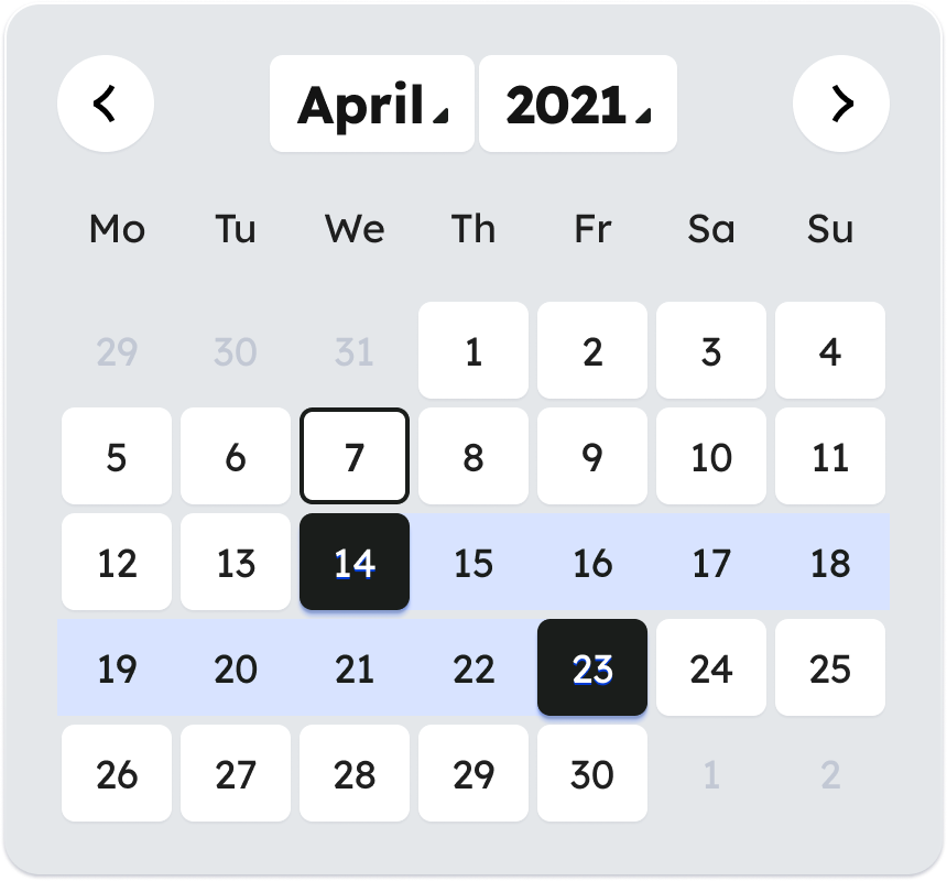
People might need to pick a date from a selection. For example, to book an appointment.
To do this, you can present dates using a calendar control. People are shown a calendar month of dates and can skip through months and years.
Only use a calendar control if people need to:
- pick a date in the near future or recent past
- know the day of the week, or the week of the month, as well as the date
- be able to see dates in relation to other dates
Do not use a calendar control that depends on JavaScript as the only input option.
Date pickers are not user-friendly for people who use assistive technology. Allow people to enter the date into a text input as well as use the calendar control.
Date of birth
Use the label:
- Date of birth
Use hint text:
- For example, 31 03 1980
Sex and gender
Sex and gender are different things. It is important to know when to ask about ‘sex’ and when to ask about ‘gender’ and to understand the difference.
Sex refers to physical characteristics, such as organs, chromosomes and hormones. It is also a label that a doctor assigns at birth - as either ‘male’ or ‘female’. This is recorded in a person's birth record and will appear on their birth certificate.
Gender refers to our internal sense of who we are and how we see and describe ourselves. A person may see themselves as a man, a woman or neither (non-binary) regardless of their sex.
Your sex is included in information about you in official records, including your:
- individual health identifier (IHI) number in health service records
- passport
- birth certificate
- Department of Social Protection (DSP) record
Through the Gender Recognition Act 2015, how sex and gender are officially recognised can legally change over time. As a result, the entry recorded for sex in official records can also change.
The Gender Recognition Act 2015
Through the Act, adults can have their ‘preferred gender’ legally recognised by the state. To do this, you must successfully apply for a gender recognition certificate.
Through this process, a person’s sex on their birth certificate, passport, other government records and IHI number can change. This means that the entry for ‘sex’ on the birth certificate when a person is born can be different from the entry for ‘sex’ on a subsequent birth certificate.
When a person is issued with a gender recognition certificate, the entry for sex in their PPS number record in the DSP is automatically updated. When the DSP record is updated, their IHI record will also be automatically updated.
Intersex
We use 'intersex' when we write about people with differences in sex development (DSD). Intersex is when a person has one or more sex characteristics that fall outside the binary male or female. These can be genetic, hormonal or physical sex characteristics. Some people prefer the term intersex to DSD but they may want to keep their legal sex as male or female.
Asking about sex
When we ask people what sex they are, we are asking them what sex is currently recorded for them in official records, as opposed to what sex a doctor assigned to them when they were born. Before the Gender Recognition Act, forms sometimes asked people to enter their 'sex registered at birth.' Since the Gender Recognition Act, ‘sex registered at birth’ can be different from their sex as it appears in official records, for some people.
Use the label:
- Select your sex
Provide these options:
- Female
- Male
Sex registered at birth
Only ask for ‘sex registered at birth’ if you need to know what sex was assigned at birth.
If you need to ask for sex registered at birth, use the label:
- Select your sex registered at birth
Provide these options:
- Female
- Male
Gender
Gender can be fixed or fluid.
Being non-binary can mean:
- having no gender
- having a different gender
- being in between genders
Use the label:
- Select your gender
Provide these options:
- Man (including trans man)
- Woman (including trans woman)
- Non-binary or gender non-conforming
- My gender is not listed here (use the box to tell us)
Existing data structures
The options may be constrained by existing data structures or the requirements of a service that already collects this data. For example, an existing data structure might not contain all the data fields needed to include all the options above. You will need to discuss the specific data structure and requirements with each service.
Ethnicity
If you ask for a person's ethnicity or background, it is recommended by HSE Social Inclusion to use the options in the CSO Data Standard for Ethnicity from the Central Statistics Office..
Use the label:
- Select an ethnic group or background