Styles - Focus states
Use these focus state styles to let users know which element they’re on and that they can interact with it.
What is a focus state?
Some people use keyboards or other devices to navigate through a page by jumping from 1 interactive element to the next. The focus state lets users know which element they’re currently on and that it's ready for them to interact with.
Our focus state styles
We use a light green colour (hse-green-300) for our focus states to make sure we meet the Web Content Accessibility Guidelines (WCAG) 2.1 level AA non-text contrast on any background colour on the HSE website.
The light green has a high contrast with dark backgrounds and the thick black border has a high contrast against light backgrounds.
Link focus state style
When links are focused, they have a light green background background. This helps the focused link stand out from the rest of the content on the page.

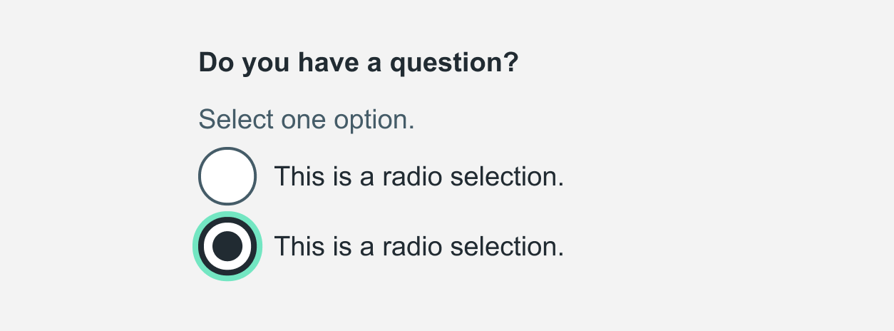
Form input focus state style
When form inputs are focused, they have a light green outline and a thick black border. If the element already has a border, the border gets thicker.
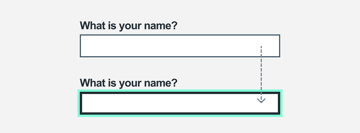
Radios and checkboxes use the same style.
Making focus states accessible for extended and modified components
If you’ve extended or modified components in the HSE digital service manual, you can use service manual styles to make the focus states of these components accessible.
How you make focus states accessible depends on whether the component is:
- focusable text without a background colour or border
- another focusable element with a background colour or border
Make focusable text accessible
If you use Sass, you should include the hse-focused-text mixin in your component's :focus selector if that component is focusable text. For example, if the component is a link in body text, or the details component:
.app-component:focus {
  @include hse-focused-text;
}
Make other focusable elements accessible
If you use Sass, you can use 3 HSE.ie frontend variables if your component has a background colour or border. For example, a text input or checkbox.
The 3 Sass variables are:
-
$hse-focus-color- light green background -
$hse-focus-text-color- black text -
$hse-focus-width- for consistent widths
Use these variables in your components instead of numeric values for the background, text and widths.
If you do not use Sass
To make a component’s focus state accessible without using Sass, you can:
- see how the
hse-focused-textmixin works:@mixin hse-focused-text { background-color: $hse-focus-color; box-shadow: 0 4px $color_hse-grey-900; color: $hse-focus-text-color; outline: $hse-focus-width solid transparent; } .app-component:focus{ @include hse-focused-text; } - get the values for
$hse-focus-colorand$hse-focus-text-colorfrom the colour page
Updated: September 2023